根据文档,我可以更改activeTintColor并activeBackgroundColor在tabBarOptions.
有没有办法用类似的样式设置选项卡按钮的样式activeTabBarStyle?
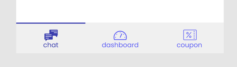
我想borderTop在活动选项卡中添加一个,如下所示:
所以我创建了一个函数来为不同的选项卡defaultNavigationOptions动态分配tabStyle:
// ...
const BottomNavigator = createBottomTabNavigator({
    Users: {
        screen: UsersStackNavigator,
    },
    Dashboard: {
        screen: DashboardStackNavigator,
    },
    Coupons: {
        screen: CouponsStackNavigator,
    }
}, {
    defaultNavigationOptions: ({ navigation }) => {
        // ...
        const active = navigation.isFocused();
        const width = active ? 2 : 0;  // This outputs 3 times, which are 2, 0, 0
        return {
            // ...
            tabBarOptions: {
                // ...
                tabStyle: {
                    paddingTop: 10,
                    borderTopColor: '#3A3AB5',
                    borderTopWidth: width
                }
            }
        };
    }
});
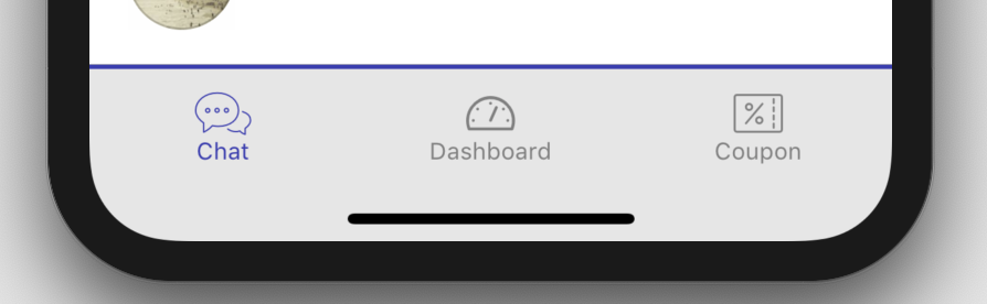
在width似乎工作,但所有的三个选项卡只使用激活navigationOptions:
我不知道为什么颜色可以不同,为什么其他款式也不一样?
任何想法如何解决它?