是否可以使用 CSS 创建一个简单的球体?我正在考虑类似 3D 球体的东西。
如何使用 CSS 创建简单的球体?
平面设计
css
2022-01-07 12:13:59
2个回答
我不喜欢已经提供的答案和评论;html - css 中简单球体的代码太多。你可以简单地做:
<div class = "sphere">Test</div>
CSS:
body {
    background: #333;
    }

.sphere {
    width: 200px;
    height: 200px;
    line-height: 200px;
    text-align: center;
    color: #FFF;
    margin: 100px auto;
    /* The magic are those 2 lines: */
    border-radius: 100%;
    box-shadow: inset 0 0 80px #FFF;
    }
然后我想挑战自己和一些更复杂的东西。这是结果:
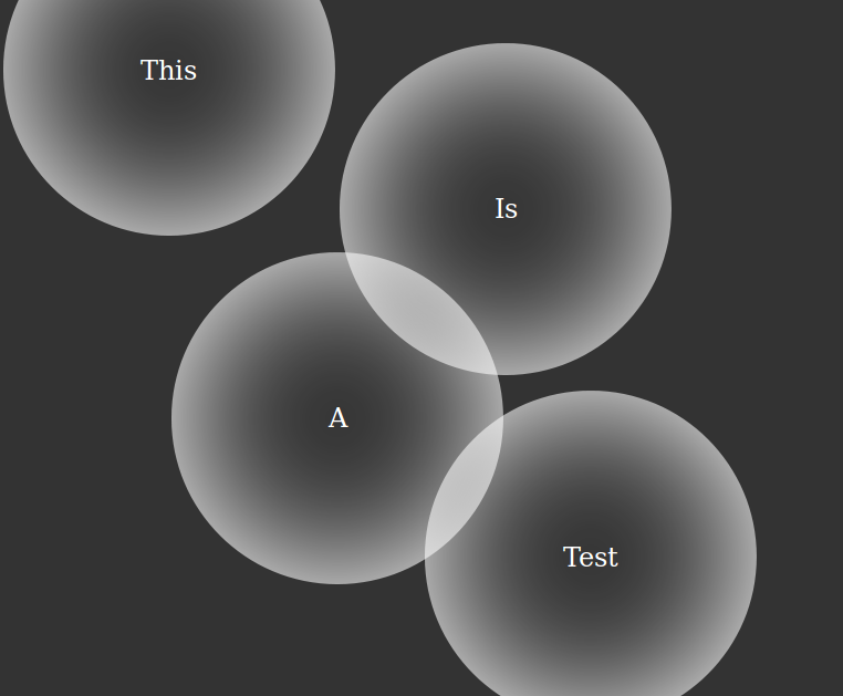
的HTML:
<div class = "sphere a">This</div>
<div class = "sphere b">Is</div>
<div class = "sphere c">A</div>
<div class = "sphere d">Test</div>
CSS:
body {
    background: #333;
}
.sphere {
    width: 200px;
    height: 200px;
    line-height: 200px;
    text-align: center;
    position: absolute;
    margin: -100px;
    border-radius: 100%;
    box-shadow: inset 0 0 80px #FFF;
    color: #FFF;
}
.a {
    top: 10%;
    left: 20%;
}
.b {
    top: 30%;
    left: 60%;
}
.c {
    top: 60%;
    left: 40%;
}
.d {
    top: 80%;
    left: 70%;
}
css
.demo-container {
 height:300px;
 overflow:hidden;
 display:block;
 position:relative;
 /* CSS3 Gradient */
 background: rgb(125,126,125);
 background: url(data:image/svg+xml;base64,PD94bWwgdmVyc2lvbj0iMS4wIiA/Pgo8c3ZnIHhtbG5zPSJodHRwOi8vd3d3LnczLm9yZy8yMDAwL3N2ZyIgd2lkdGg9IjEwMCUiIGhlaWdodD0iMTAwJSIgdmlld0JveD0iMCAwIDEgMSIgcHJlc2VydmVBc3BlY3RSYXRpbz0ibm9uZSI+CiAgPHJhZGlhbEdyYWRpZW50IGlkPSJncmFkLXVjZ2ctZ2VuZXJhdGVkIiBncmFkaWVudFVuaXRzPSJ1c2VyU3BhY2VPblVzZSIgY3g9IjUwJSIgY3k9IjUwJSIgcj0iNzUlIj4KICAgIDxzdG9wIG9mZnNldD0iMCUiIHN0b3AtY29sb3I9IiM3ZDdlN2QiIHN0b3Atb3BhY2l0eT0iMSIvPgogICAgPHN0b3Agb2Zmc2V0PSIxMDAlIiBzdG9wLWNvbG9yPSIjMGUwZTBlIiBzdG9wLW9wYWNpdHk9IjEiLz4KICA8L3JhZGlhbEdyYWRpZW50PgogIDxyZWN0IHg9Ii01MCIgeT0iLTUwIiB3aWR0aD0iMTAxIiBoZWlnaHQ9IjEwMSIgZmlsbD0idXJsKCNncmFkLXVjZ2ctZ2VuZXJhdGVkKSIgLz4KPC9zdmc+);
 background: -moz-radial-gradient(center, ellipse cover,  rgba(125,126,125,1) 0%, rgba(14,14,14,1) 100%);
 background: -webkit-gradient(radial, center center, 0px, center center, 100%, color-stop(0%,rgba(125,126,125,1)), color-stop(100%,rgba(14,14,14,1)));
 background: -webkit-radial-gradient(center, ellipse cover,  rgba(125,126,125,1) 0%,rgba(14,14,14,1) 100%);
 background: -o-radial-gradient(center, ellipse cover,  rgba(125,126,125,1) 0%,rgba(14,14,14,1) 100%);
 background: -ms-radial-gradient(center, ellipse cover,  rgba(125,126,125,1) 0%,rgba(14,14,14,1) 100%);
 background: radial-gradient(ellipse at center,  rgba(125,126,125,1) 0%,rgba(14,14,14,1) 100%);
 filter: progid:DXImageTransform.Microsoft.gradient( startColorstr='#7d7e7d', endColorstr='#0e0e0e',GradientType=1 );
 }
.bubble1, .bubble2, .bubble3, .bubble4 {
 position:absolute;
 display:block;
 /* CSS3 Box Shadow */
 box-shadow:0 20px 30px rgba(0, 0, 0, 0.2), inset 0px 10px 30px 5px rgba(255, 255, 255, 1);
 -webkit-box-shadow:0 20px 30px rgba(0, 0, 0, 0.2), inset 0px 10px 30px 5px rgba(255, 255, 255, 1);
 -moz-box-shadow:0 20px 30px rgba(0, 0, 0, 0.2), inset 0px 10px 30px 5px rgba(255, 255, 255, 1);
 /* CSS3 Border Radius */
 border-radius:50%;
 -webkit-border-radius:50%;
 -moz-border-radius:50%;
 /* CSS3 Transition */
 -webkit-transition: all .5s ease-in-out;
 -moz-transition: all .5s ease-in-out;
 -o-transition: all .5s ease-in-out;
 transition: all .5s ease-in-out;
 }
.bubble1 {
 width:100px;
 height:100px;
 top:20%;
 left:50%;
 }
.bubble2 {
 width:200px;
 height:200px;
 left:20%;
 top:10%;
 }
.bubble3 {
 width:150px;
 height:150px;
 left:50%;
 top:40%;
 }
.bubble4 {
 width:90px;
 height:90px;
 left:70%;
 top:15%;
 }
/* .bubble1:hover {
 margin-top:30px;
 width:90px;
 }
.bubble2:hover {
 margin-left:20px;
 height:190px;
 }
.bubble3:hover {
 margin-top:60px;
 width:160px;
 }
.bubble4:hover {
 margin-left:50px;
 height:100px;
 }  */

/* remove below codes if you don't wish to have the texts "3D Bubbles" */
.demo-text{
 position:absolute;
 bottom:20px;
 right:15px;
 font-size:36px;
 color:#666;
 text-shadow:0 2px 0 #000;
 }
html
<div class="demo-container">
 <span class="bubble1"></span>
 <span class="bubble2"></span>
 <span class="bubble3"></span>
 <span class="bubble4"></span>
 <div class="demo-text">3D Bubbles</div> <!-- remove this div if you don't wish to have the texts "3D Bubbles" -->
</div>