CSS 中是否有背景过滤器的替代方案?为了让这个例子工作,我必须启用chrome://flags/#enable-experimental-web-platform-features
body {
  background: url('http://verdewall.com/wp-content/uploads/2016/08/Background-Images-4H9.jpg') no-repeat center;
}

.glass {
  width: 100%;
  height: 500px;
  background: rgba(0,0,0,0.8);

  -webkit-backdrop-filter: contrast(4) blur(30px);
  backdrop-filter: contrast(4) blur(30px);
}
<!DOCTYPE html>
<html>
<head>
<meta charset="utf-8">
<meta name="viewport" content="width=device-width">
<title>Blur</title>
</head>
<body>
<div class="glass">
</div>
</body>
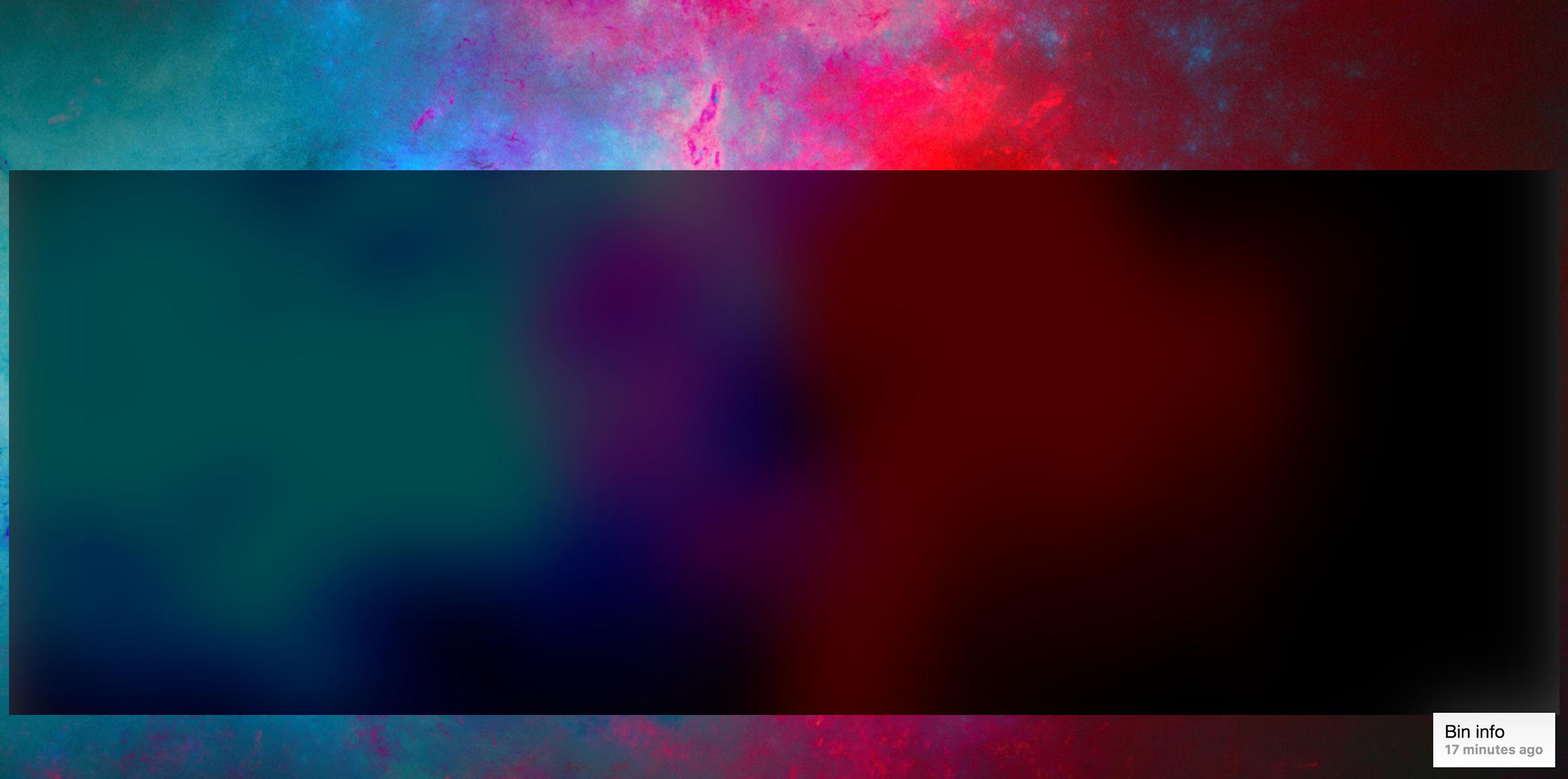
</html>这是启用实验性功能后的样子:
问题是它下面的内容将是动态的。所以并不是所有的都是图像,我发现的替代品只适用于图像。就像这里显示的模糊的半透明一样:
